模仿element-ui封装vue组件库(二)

四、封装一个element-ui风格的dialog组件
前置知识:
- vue过渡动画
- sync修饰符
- 具名插槽与v-slot指令
参数支持:
| 参数名 | 参数描述 | 参数类型 | 默认值 |
|---|---|---|---|
| title | 对话框标题 | string |
提示 |
| width | 宽度 | string |
50% |
| top | 与顶部的距离 | string | 15vh |
| visible | 是否显示dialog(支持sync修饰符) | boolean | false |
事件支持:
| 事件名 | 事件描述 |
|---|---|
| opened | 模态框显示事件 |
| closed | 模态框关闭事件 |
插槽说明:
| 插槽名称 | 插槽描述 |
|---|---|
| default | dialog的内容 |
| title | dialog的标题 |
| footer | dialog的底部操作区 |
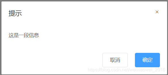
4.1dialog组件的基本框架和样式
首先搭建起来dialog组件的框架,暂时不加入插槽,只构建出基本的框架和样式。
框架分为三个部分,头部(header)、内容(body)、底部(footer),基本框架如下:
<template>
 <div class="one-dialog_wrapper">
   <div class="one-dialog">
     <div class="one-dialog_header">
       <span class="one-dialog_title">提示</span>
       <button class="one-dialog_headerbtn">
         <i class="one-icon-close"></i>
       </button>
     </div>
     <div class="one-dialog_body">
       <span>这是一段信息</span>
     </div>
     <div class="one-dialog_footer">
       <one-button>取消</one-button>
       <one-button type="primary">确定</one-button>
     </div>
   </div>
 </div>
</template>
样式如下:
<style lang="scss" scoped>
.one-dialog_wrapper{
  position: fixed;
  top: 0;
  right: 0;
  bottom: 0;
  left: 0;
  overflow: auto;
  margin: 0;
  z-index: 2001;
  background-color: rgba(0,0,0,0.5);
  .one-dialog{
    position: relative;
    margin: 15vh auto 50px;
    background: #fff;
    border-radius: 2px;
    box-shadow: 0 1px 3px rgba(0,0,0,0.3);
    box-sizing: border-box;
    width: 30%;
    &_header{
      padding: 20px 20px 10px;
      .one-dialog_title{
        line-height: 24px;
        font-size: 18px;
        color: #303133;
      }
      .one-dialog_headerbtn{
        position: absolute;
        top: 20px;
        right: 20px;
        padding: 0;
        background: transparent;
        border: none;
        outline: none;
        cursor: pointer;
        font-size: 16px;
        .one-icon-close{
          color:909399
        }
      }
    }
    &_body{
      padding: 30px 20px;
      color: #606266;
      font-size: 14px;
      word-break: break-all;
    }
    &_footer{
      padding: 10px 20px 20px;
      text-align: right;
      box-sizing: border-box;
      ::v-deep .one-button:first-child{
        margin-right: 20px;
      }
    }
  }
}
</style>
在main.js注册后,在app.vue中引用,形成以下效果:
4.2自定义title内容
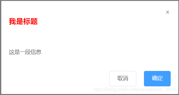
title标题部分除了普通的标题内容外,也应该可以设置标题的样式,比如设置为h1红色的自定义标题内容,所以在这里我们就使用到了插槽,可以在使用时按照需求自定义标题内容和样式。
4.2.0父子组件传值以及props验证不再赘述,之前内容已经介绍。
4.2.1将标题span标签放到slot插槽下,这样便于控制span的内容和样式。
<template>
 <div class="one-dialog_wrapper">
   <div class="one-dialog">
     <div class="one-dialog_header">
       <slot name="title">
         <!-- 将span放到slot内,这样不仅可以定义title文本,还可以定义样式等 -->
        <span class="one-dialog_title">
          {{title}}
        </span>
       </slot>
       <button class="one-dialog_headerbtn">
         <i class="one-icon-close"></i>
       </button>
     </div>
     <div class="one-dialog_body">
       <span>这是一段信息</span>
     </div>
     <div class="one-dialog_footer">
       <one-button>取消</one-button>
       <one-button type="primary">确定</one-button>
     </div>
   </div>
 </div>
</template>
4.2.2通过父子组件之间得传值以及slot指定组件自定义title内容和样式。
 <one-dialog title="温馨提示">
  <!-- 使用v-slot指定插槽进行编辑 -->
  <template v-slot:title>
    <h3 style="color:red">我是标题</h3>
  </template>
 </one-dialog>
4.2.3效果如下
4.3自定义dialog的宽度和距离顶部的
4.3.1实现在组件调用时控制dialog组件的宽度以及位置。
只需要在父组件中传递宽度和高度,并且在子组件中获取并且使用即可。
父组件传值:
<one-dialog width="80%" top="200px"></one-dialog>
子组件使用:
<template>
 <div class="one-dialog_wrapper">
   <div class="one-dialog" :style="{width:width,marginTop:top}">
     ···
   </div>
 </div>
</template>
4.4自定义body内容
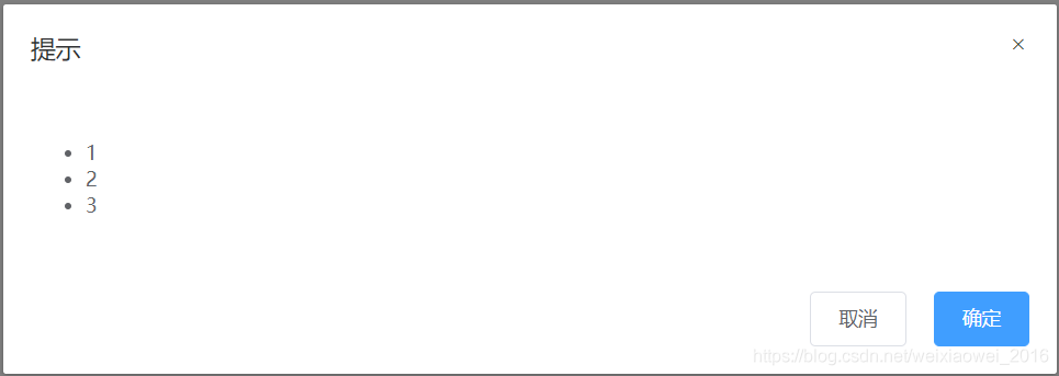
body内容可能是除span以外的其他内容,比如列表等,所以在这里使用插,并且在这里使用匿名插槽,使用匿名插槽的好处就是在使用时不需要使用template标签指定内容,直接在组件标签下编写内容即可。
4.4.1在body中使用匿名组件
     <div class="one-dialog_body">
       <slot></slot>
     </div>
4.4.2在父组件中,只需要在标签下直接编辑内容即可,不需要再使用template标签绑定插槽或者父子组件传值了
      <one-dialog>
        <ul>
          <li>1</li>
          <li>2</li>
          <li>3</li>
        </ul>
      </one-dialog>
4.4.3显示效果
4.5自定义footer内容
footer中使用slot插槽,在父组件中的定义底部内容。
4.5.1设置footer插槽,如果没有指定footer插槽,则不显示
     <div class="one-dialog_footer">
       <!-- 如果footer不传递内容,则不显示footer -->
       <slot name="footer" v-if="$slots.footer"></slot>
     </div>
4.5.2父组件中的定义footer插槽内容
        <template v-slot:footer>
          <one-button>取消</one-button>
          <one-button type="primary">确定</one-button>
        </template>
4.6dialog的显示与隐藏
dialog组件的显示与隐藏,需要使用到sync语法糖。这里简单介绍以下什么是sync语法糖,sync通俗来说,是父子组件传值过程中提供的一种模式,这种模式有两个功能:1.将父组件向子组件传值;2.子组件回调一个值给父组件。
打个比方,如下代码需要两部才能实现上述功能:1.向子组件传值;2.接收子组件回调的值
//父组件传值
<demo :visible="visible" :money="money" @update:aa="fn1"></demo>
//子组件回调
  methods: {
    fn () {
     this.$emit('aa', 200)
    }
  }
使用sync语法糖后,父组件不需要单独声明一个方法,只需要在回调时声明一个update绑定的回调函数(这个绑定值是传值自身)这样在父组件中就不需要再次定义回调函数进行接收了。
//父组件中的使用sync语法糖,传递和接收参数

  <demo :visible.sync="visible" :money.sync="money"></demo>
//子组件中使用update绑定参数的方法进行回调
  methods: {
    fn () {
      this.$emit('update:money', 200)
      this.$emit('update:visible', true)
    }
  }
根据上面对于sync语法糖的介绍,我们在dialog显示和隐藏中要进行两种处理
控制dialog的显示和隐藏,我们首先在子组件中使用v-show对于组建的显示与隐藏进行控制。
<div class="one-dialog_wrapper" v-show="visible" @click.self="handleClose">
   ···
</div>
4.6.1父组件控制dialog的显示和隐藏
父组件中的直接通过传递一个参数visible,使用点击方法控制这个参数的布尔值即可。
      <one-dialog :visible.sync="visible">
        <ul>
          <li>1</li>
          <li>2</li>
          <li>3</li>
        </ul>
        <template v-slot:footer>
          <one-button @click="switchDialog">取消</one-button>
          <one-button type="primary">确定</one-button>
        </template>
      </one-dialog>
4.6.2子组件控制dialog的显示和隐藏
子组件控制dialog的显示和隐藏,不能直接修改父组件传递过来的值,需要使用回调触发父组件中的值进行修改,这里就使用到了上面介绍的sync语法糖。
首先在父组件中使用:visible.sync="visible"向子组件进行传值并且接收子组件回调。
    <div class="row">
      <one-dialog :visible.sync="visible">
        <ul>
          <li>1</li>
          <li>2</li>
          <li>3</li>
        </ul>
        <template v-slot:footer>
          <one-button @click="switchDialog">取消</one-button>
          <one-button type="primary">确定</one-button>
        </template>
      </one-dialog>
子组件通过自身定义的方法,控制dialog组件的显示与隐藏,然后将visible属性回调给父组件。
<template v-slot:footer>
  <one-button>取消</one-button>
  <one-button type="primary">确定</one-button>
</template>
回调方法:
  method{
    handleClose () {
      this.$emit('update:visible', false)
    }
  }
4.7dialog的动画效果
使用transition包裹一个元素后,这个元素就会被自动添加类名,这部分vuejs文档都有介绍。
4.7.1使用transition包裹整个dialog框架
<template>
  <transition name="dialog-fade">
    <div class="one-dialog_wrapper" v-show="visible" @click.self="handleClose">
        ···
    </div>
  </transition>
</template>
4.7.2使用vue动画进行处理
这里先定义了fade动画,然后在dialog组件显示和隐藏的时候调用(反向调用)这个动画。
.dialog-fade-enter-active{
  animation: fade .3s;
}
.dialog-fade-leave-active{
  animation: fade .3s reverse;
}
@keyframes fade{
  0% {
    opacity: 0;
    transform: translateY(-20px);
  }
  100%{
    opacity: 1;
    transform: translateY(0);
  }
}
-------------------------------------------------------至此,dialog组件封装完成!------------------------------------------
附组件代码:
<template>
  <transition name="dialog-fade">
    <!-- @click.self避免冒泡,只有点击自己时才能触发   -->
    <div class="one-dialog_wrapper" v-show="visible" @click.self="handleClose">
      <div class="one-dialog" :style="{width:width,marginTop:top}">
        <div class="one-dialog_header">
          <slot name="title">
            <!-- 将span放到slot内,这样不仅可以定义title文本,还可以定义样式等 -->
          <span class="one-dialog_title">
            {{title}}
          </span>
          </slot>
          <button class="one-dialog_headerbtn" @click="handleClose">
            <i class="one-icon-close"></i>
          </button>
        </div>
        <div class="one-dialog_body">
          <!-- 内容可能是除span以外的其他内容,比如列表等,所以在这里使用插槽,并且不规定插槽内具体的标签 -->
          <!-- 并且在这里使用匿名插槽,使用匿名插槽的好处就是不用指定名称,这样在不使用<template v-slot>指定插槽内容的时候,也可以自定义内容 -->
          <slot></slot>
        </div>
        <div class="one-dialog_footer">
          <!-- 如果footer不传递内容,则不显示footer -->
          <slot name="footer" v-if="$slots.footer">
          </slot>
        </div>
      </div>
    </div>
  </transition>
</template>

<script>

export default {
  name: 'oneDialog',
  components: {
  },
  props: {
    title: {
      type: String,
      default: '提示'
    },
    width: {
      type: String,
      default: '50%'
    },
    top: {
      type: String,
      default: '15vh'
    },
    footer: {
      type: Object
    },
    visible: {
      type: Boolean,
      default: false
    }
  },
  data () {
    return {
      show: false
    }
  },
  methods: {
    handleClose () {
      this.$emit('update:visible', false)
    }
  }
}
</script>

<style lang="scss" scoped>
.one-dialog_wrapper{
  position: fixed;
  top: 0;
  right: 0;
  bottom: 0;
  left: 0;
  overflow: auto;
  margin: 0;
  z-index: 2001;
  background-color: rgba(0,0,0,0.5);
  .one-dialog{
    position: relative;
    margin: 15vh auto 50px;
    background: #fff;
    border-radius: 2px;
    box-shadow: 0 1px 3px rgba(0,0,0,0.3);
    box-sizing: border-box;
    width: 30%;
    &_header{
      padding: 20px 20px 10px;
      .one-dialog_title{
        line-height: 24px;
        font-size: 18px;
        color: #303133;
      }
      .one-dialog_headerbtn{
        position: absolute;
        top: 20px;
        right: 20px;
        padding: 0;
        background: transparent;
        border: none;
        outline: none;
        cursor: pointer;
        font-size: 16px;
        .one-icon-close{
          color:909399
        }
      }
    }
    &_body{
      padding: 30px 20px;
      color: #606266;
      font-size: 14px;
      word-break: break-all;
    }
    &_footer{
      padding: 10px 20px 20px;
      text-align: right;
      box-sizing: border-box;
      ::v-deep .one-button:first-child{
        margin-right: 20px;
      }
    }
  }
}
.dialog-fade-enter-active{
  animation: fade .3s;
}
.dialog-fade-leave-active{
  animation: fade .3s reverse;
}
@keyframes fade{
  0% {
    opacity: 0;
    transform: translateY(-20px);
  }
  100%{
    opacity: 1;
    transform: translateY(0);
  }
}
</style>
{{ cmt.username }}
{{ cmt.content }}
{{ cmt.commentDate | formatDate('YYYY.MM.DD hh:mm') }}